Is Your Landing Page Performing Well? Key Elements of High-Converting Pages
Here's something that comes up a lot.
A landing page looks great. Everyone likes the design. It feels modern. Smooth animations, clean layout, nice colours. And yet, nothing happens. Traffic comes in, but enquiries, sign-ups or sales don't move.
That usually means the landing page is not broken. It's just not focused.
A landing page only has one real job. It needs to get someone to take action. Everything else is secondary.
In 2025, that job is harder than it used to be. People are impatient. They skim. They click away quickly. If a page doesn't make sense almost immediately, they don't wait around to understand it.
This is why brands that approach website development and web design with conversion in mind tend to perform better. And why brands that design purely for aesthetics struggle to turn traffic into customers.
The gap isn't talent or effort. It's clarity.
So how do you tell if a landing page is actually working?
What makes a high converting landing page different from one that's just okay?
Most of the time, it's not one big issue. It's a collection of small ones.
What People See in the First Few Seconds
When someone lands on your page, they're not reading it properly. They're scanning.
They should be able to tell very quickly what's being offered, who it's meant for, and whether it's relevant to them. If they need to scroll or read multiple sections to figure that out, you're asking for too much effort.
This is where many landing pages lose people.
Brands like Slack and Shopify are good examples of doing this well. Their messaging is direct. You don't have to interpret it. You don't have to guess what the next step is.
When the value is obvious, people stay. When it isn't, landing page performance drops because users don't want to work for clarity.
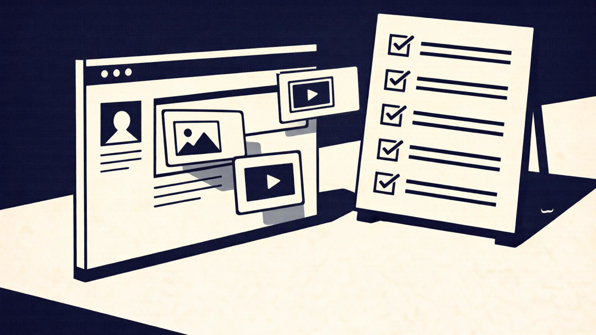
Design That Actually Helps, Not Just Looks Good
Good landing page design isn't about showing how creative you are. It's about making decisions easier.
Every element on the page should support the same outcome. Images, spacing, colours, buttons. When too many things compete for attention, users hesitate. And hesitation usually means no action.
Dropbox's landing pages are a good reference here. They're simple on purpose. Nothing pulls focus away from the main action.
A useful way to look at design decisions is to ask one question: does this help someone move forward, or does it slow them down?
Ads and Landing Pages Need to Match
A lot of landing page optimization issues start before the user even reaches the page.
When someone clicks an ad or a social post, they expect continuity. If the headline, language or offer feels different from what they just clicked, trust drops straight away.
This is something HubSpot does well. The wording in their ads usually carries through to their landing pages, which makes the experience feel consistent.
When things line up, users feel confident. When they don't, friction creeps in.
Social Proof Should Calm Doubt, Not Add Noise
Most people hesitate before taking action. That hesitation increases when money, time or personal information is involved.
Social proof helps reduce that hesitation, but only if it's used properly.
Testimonials, client logos, reviews or simple credibility markers work best when they're placed where a user might pause. Not dumped everywhere on the page.
Brands like Zoom and Notion use proof sparingly. It's there when you need reassurance, not shouting for attention.
Good social proof reassures. It doesn't overwhelm.
Speed Still Kills or Saves Conversions
This one is simple.
If your landing page is slow, conversions will suffer. No amount of good copy or design fixes that.
People expect pages to load quickly. Even small delays lead to drop-offs. Amazon has shown this for years, and Google keeps reinforcing it through Core Web Vitals.
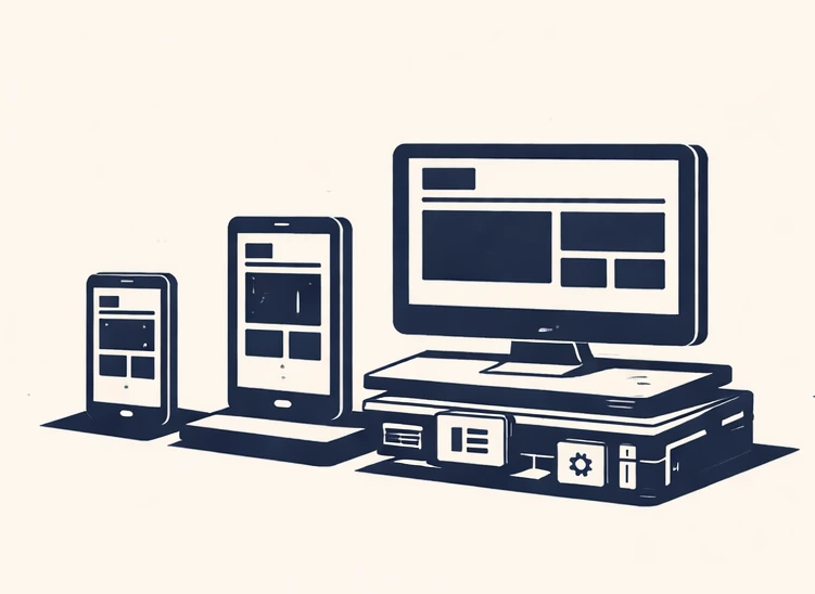
Strong landing page performance depends on pages being fast, mobile-friendly, responsive and technically stable.
Good messaging and solid engineering need to work together.
CTAs Need to Be Obvious
Calls to action fail when they're vague.
Buttons like "Submit" or "Learn More" don't tell users what's actually going to happen. High converting landing pages are much clearer.
"Get a Free Audit." "Book a Strategy Call." "Start Your Free Trial."
Calendly and Webflow do this well. The action feels low-risk because the outcome is clear.
A good CTA should feel like the next logical step, not a big commitment.
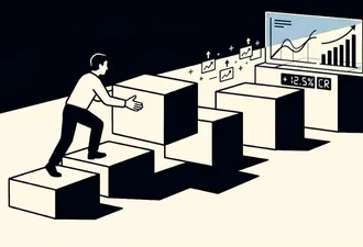
Landing Pages Are Not One-Time Projects
One of the biggest mistakes teams make is treating a landing page as finished once it goes live.
The best-performing brands keep testing. Small changes to headlines, layouts, forms or CTAs can make a noticeable difference over time.
Airbnb is known for constant experimentation. They test, learn and adjust continuously.
Teams that care about conversions treat landing pages as evolving assets, not static designs.
So, Is Your Landing Page Actually Working?
A strong landing page is rarely the result of one perfect element.
Strategy, design, messaging and performance all need to work together. When traffic is coming in but conversions are low, it's usually a combination of small gaps rather than one obvious mistake.
The real question isn't whether a page looks good.
It's whether it's doing what it was built to do.
Building Landing Pages That Convert
At Futuready, we focus on landing pages built for outcomes, not just aesthetics.
Our work combines:
- Conversion-led web design
- Strong website development foundations
- Practical landing page optimization
- Ongoing testing and improvement
If you're spending money to drive traffic, your landing pages need to earn it.
Let's build landing pages that don't just attract visitors. Let's build pages that actually convert.