The Modern Landing Page Blueprint: Combining Ads, SEO and Psychology for Maximum Conversions
Your ad is not the problem.
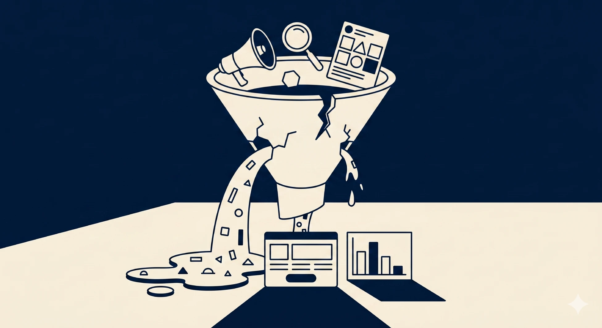
Most businesses running paid campaigns in India have decent creatives, reasonable targeting, and acceptable click-through rates. The problem almost always lives one step further down the journey on the landing page itself.
A landing page is where every rupee you spend on ads either earns a return or disappears. Yet most businesses treat it as an afterthought rather than the high-performance conversion asset it needs to be. Building one that truly works means combining performance marketing, SEO fundamentals, and the principles of consumer psychology into a single, seamless experience.
This is the modern landing page blueprint, and it is what separates campaigns that generate clicks from campaigns that generate revenue.
What Makes a Modern Landing Page Different?
A traditional landing page was built around one idea: get the visitor to fill a form.
A modern landing page is built around a deeper understanding of how people actually make decisions. It accounts for where the visitor came from, what they were promised in the ad, what psychological triggers influence their trust, and what friction points are standing between them and conversion.
When Paid Ads, SEO, Content, and conversion psychology work together on a single page, the results are dramatically different from pages that focus on any one of these elements in isolation.
Layer 1: Start With the Ad Promise
The single most overlooked principle in landing page design is message match.
Every visitor arriving on your landing page came from somewhere. A Google search. A Meta ad. An email campaign. Each of those entry points made a specific promise or created a specific expectation in the visitor's mind.
If your landing page does not immediately reflect that promise, the visitor feels a disconnect. That disconnect destroys trust within seconds, and a visitor who has lost trust will not convert regardless of how good the rest of the page is.
The headline of your landing page must directly mirror the message of the ad that brought the visitor there. The offer must be identical. The tone must feel continuous. When a visitor lands on your page and immediately thinks "yes, this is exactly what I was looking for," you have passed the first and most critical test of a high-converting landing page.
Layer 2: SEO Foundations That Support Paid Performance
Most people think of landing pages as either SEO pages or paid ad pages. The best ones are both.
A landing page with strong SEO foundations loads faster, earns organic traffic between paid campaigns, and signals credibility to both search engines and visitors. Page speed, mobile optimization, clean URL structure, and clear heading hierarchy are not just SEO requirements. They are conversion requirements.
Google's Quality Score for paid ads is directly influenced by landing page experience. A slow, poorly structured landing page increases your cost per click and reduces your ad's reach. Fixing these technical foundations improves both your organic visibility and the efficiency of every rupee you spend on paid campaigns.
The two are not competing priorities. They are complementary ones.
Layer 3: The Psychology of Conversion
This is the layer most digital marketing advice skips over, and it is the one that makes the biggest difference.
Human beings do not make purchasing decisions purely on logic. They make them based on emotion, social proof, perceived risk, and cognitive shortcuts. A landing page that understands and applies these principles converts at a significantly higher rate than one that does not.
Here are the key psychological principles every modern landing page must apply:
Clarity Over Cleverness
Your visitor should understand exactly what you offer, who it is for, and what they need to do next within the first five seconds of landing on your page. Clever headlines and abstract language might win creative awards but they lose conversions. Be specific. Be clear. Be direct.
Social Proof Reduces Perceived Risk
Before a visitor converts, they are silently asking one question: can I trust these people?
Testimonials, client logos, case study results, star ratings, and media mentions all answer that question without the visitor having to ask it out loud. The more specific and credible your social proof, the more powerfully it reduces the hesitation standing between a visitor and a conversion.
Scarcity and Urgency Drive Action
When everything is available forever at any price, there is no reason to act now. Limited time offers, limited availability, and deadline-driven CTAs create a genuine reason for visitors to make a decision today rather than deferring it indefinitely.
Use these ethically and honestly. False scarcity destroys trust permanently.
One Page, One Goal
Every additional option you give a visitor reduces the probability they take the action you actually want. Navigation menus, multiple CTAs pointing to different destinations, and links to unrelated pages all bleed conversion rate.
A great landing page has one clear goal. Everything on the page serves that goal and nothing else.
Layer 4: Content That Converts, Not Just Informs
The words on your landing page are doing active selling work. They are not there to explain your product in neutral terms. They are there to move a visitor from consideration to commitment.
Strong landing page content is written from the visitor's perspective, not the brand's. It leads with the problem the visitor is trying to solve, not with how great the company is. It speaks directly to the specific fears, desires, and objections of the target audience. And it earns trust through specificity rather than generic claims.
"We help businesses grow" tells a visitor nothing. "We have helped 200 brands across India generate qualified leads through conversion-first digital systems" tells them something specific, credible, and relevant.
Every headline, subheading, bullet point, and CTA on your landing page should be pulling the visitor closer to conversion. If any element is not doing that work, it does not belong on the page.
Well-crafted content strategy gives landing page copy its persuasive edge, ensuring every word earns its place on the page.
Layer 5: Design and Development That Removes Friction
Even the best copy and psychology will fail if the page itself creates friction.
Friction is anything that makes it harder for a visitor to complete the desired action. Long forms asking for unnecessary information. Buttons that are hard to find on mobile. Slow load times that test patience. Confusing layouts that force visitors to think too hard about what to do next.
A high-converting landing page removes every possible obstacle between the visitor and the conversion. Forms ask only for what is genuinely needed. CTAs are visible, clear, and repeated at the right intervals. The mobile experience is just as clean and fast as the desktop version.
The visual design must also build trust at a glance. A page that looks outdated, cluttered, or inconsistent with the brand signals to visitors that the business behind it may not be reliable. First impressions on landing pages are formed in milliseconds, and those impressions directly influence conversion rates.
Thoughtful website design ensures your landing page looks credible, loads fast, and converts consistently across every device.
Real Example: How This Blueprint Worked for BookMyShow
Theory is useful. Real results are better.
When BookMyShow partnered with Futuready Media for the Travis Scott India tour, the challenge was a familiar one. The concerts were scheduled mid-week, making it genuinely difficult for working professionals and students to attend. Most brands would have run a straightforward promotional campaign and accepted the reduced attendance potential.
Instead, we built a campaign around a single insight: if taking leave was the barrier, make the leave letter the campaign.
The result was Sicko Leave, an interactive, mobile-first landing page that allowed fans to generate personalised leave excuse letters to download and share. The page was built around frictionless UX, fast load times, clear calls to action, and a single conversion goal: get users to generate and share their letter.
The campaign required no heavy media spend to scale. The shareable nature of the tool created organic distribution. The results spoke for themselves.
Over 28,000 unique forms were generated. Organic sharing drove substantial reach across platforms. The campaign delivered measurable first-party data and strong ROI for the client, all from a landing page built on the exact principles this blueprint describes.
You can read the full story in our BookMyShow Sicko Leave case study.
Putting the Blueprint Together
A modern high-converting landing page combines all five layers into one seamless experience:
- The headline matches the ad promise exactly
- The page loads fast, works perfectly on mobile, and is technically sound for SEO
- Psychological triggers including social proof, scarcity, and clarity are applied throughout
- The copy speaks directly to the visitor's problem and earns trust through specificity
- The design removes friction and makes the conversion action obvious and effortless
When these five layers work together, your landing page stops being a destination and becomes a conversion engine. Every rupee spent on ads returns more. Every organic visitor is more likely to take action. Every campaign performs better without increasing the budget.
Quick Takeaway
A landing page is not a formality at the end of an ad campaign. It is the most important conversion asset in your entire digital marketing system. Build it with the same strategic intent you bring to your ads, your SEO, and your content, and it will consistently outperform any page built as an afterthought.
Conclusion
The brands generating the strongest returns from paid campaigns in India are not necessarily the ones with the biggest budgets. They are the ones with the best landing pages.
Combining Paid Ads, SEO fundamentals, conversion psychology, and purposeful content into a single, well-designed page is what transforms marketing spend from a cost into a compounding investment.
If your current landing pages are not converting at the rate your business needs, the blueprint is clear. Build each layer deliberately, test continuously, and treat your landing page as the revenue asset it truly is.
Ready to build landing pages that actually convert? Talk to our team and let us put the right foundations in place for your campaigns.
Commonly asked.
Honestly answered.
A modern landing page is a focused, conversion-optimized page built around a single goal. Unlike a regular webpage, it is designed to receive traffic from a specific source such as a paid ad or organic search, and guide visitors toward one clear action through strategic content, psychology, and design without the distractions of full website navigation.
Message match ensures that what a visitor was promised in an ad is immediately reflected when they land on the page. When the headline, offer, and tone are consistent across the ad and the landing page, visitors feel they are in the right place. Any disconnect between the two creates doubt, reduces trust, and significantly lowers conversion rates.
SEO improvements such as faster page load speed, clean mobile experience, and proper heading structure directly improve Google's Quality Score for paid campaigns. A higher Quality Score means lower cost per click and better ad placement. These same improvements also make the page eligible to earn organic traffic, giving it value beyond the life of a paid campaign.
The most effective principles include clarity in messaging, social proof through testimonials and case studies, urgency through limited time or limited availability offers, and reducing friction by keeping the page focused on a single goal. Together these principles align with how people naturally make decisions and remove the hesitation that prevents conversions.
A landing page should have one primary conversion goal with the CTA repeated at strategic points, typically above the fold, after the key benefit section, and near the bottom. Multiple CTAs pointing to different destinations dilute focus and reduce the likelihood that visitors take the action you actually want.
Key signals include a high bounce rate from paid traffic, low form submission rates despite reasonable click-through rates on ads, poor performance on mobile devices, slow page load times, and a significant drop-off between ad clicks and actual enquiries or purchases.